
prevention
How to Reduce Cart Abandonment on Shopify: 12 Strategies
A prioritized guide to reducing cart abandonment on Shopify, using Baymard's current published figures on why shoppers leave, plus where onsite prevention fits.
 ChatGPT
 Perplexity
 Gemini
 Claude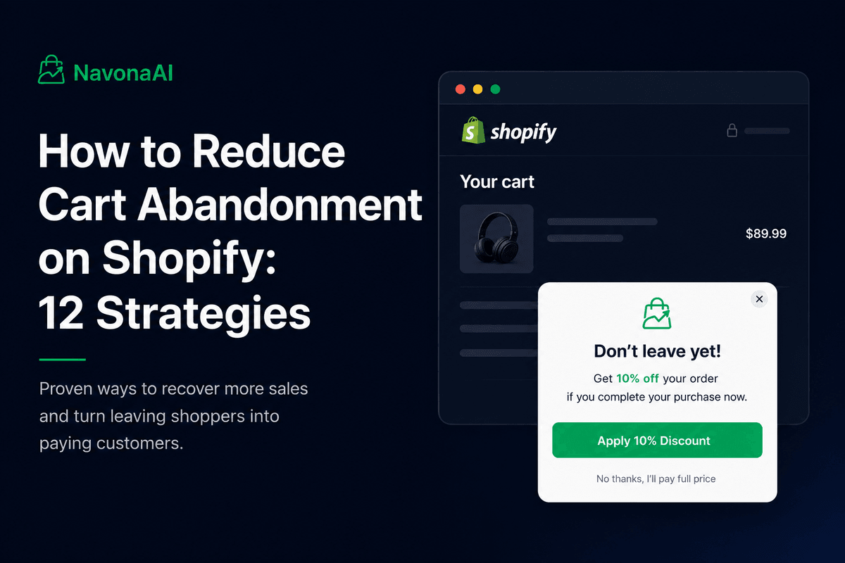
Most cart abandonment advice tells you what to do after a shopper leaves. By then, there isn't much left to change. A better approach starts earlier and works in two parts. First, remove the things that actually make people leave, starting with cost surprise, which Baymard Institute puts at 40%, the single biggest reason among the ones a store can actually fix. Second, give a reason to buy right now to the shoppers who weren't ready to buy in the first place, since no amount of checkout polish helps with that second group.
That second group is bigger than most guides let on. It's also why stores fix everything they can find and the abandonment rate still barely moves.
There are two different kinds of abandoners
Most guides treat abandonment as one problem with one checklist. It's actually two separate problems, and each one needs a different fix.
The first shopper has a specific need. Their shampoo ran out, or they need a birthday gift by Saturday. They already planned to buy something. When this shopper leaves, it's because something got in the way, an unexpected shipping cost, a checkout that demanded a password, they couldn't find the delivery date. Remove the obstacle and they'll finish the purchase.
The second shopper was just browsing. They saw something they liked and added it to their cart, but adding it never meant they'd decided to buy it, only that they liked it enough to keep it around. The cart became a wishlist. Nothing about your store may be wrong for this shopper at all. They simply never had a reason to buy today instead of some vague later, and later usually means never. Baymard's own data backs this up: 42% of US shoppers say they abandoned a cart because they were browsing or not ready to buy.
This is why so many stores hit a wall. Fix checkout, and abandonment drops for a while, then stops dropping no matter what else changes. What's left at that point is mostly this second group, and checkout fixes have nothing left to offer them. What they need instead is a reason to act now.
The strategies below cover both groups. Strategies 1 through 11 remove friction for the first group. Strategy 12 is built for the shoppers who never hit any friction to begin with.
Why shoppers actually abandon their carts
The number everyone quotes is 70.22%. Baymard calculates this as the average across 50 studies going back to 2006, updated as recently as September 2025, and it's a solid figure. But it's a blended average of 50 different studies that don't all measure the same thing the same way, different industries, different definitions of "abandoned," different traffic mixes. That's why the individual studies underneath it range all the way from 55% to 84.27%. Your own store is one specific situation, closer to one of those individual studies than to the blended average, so your own healthy number could reasonably sit anywhere in that range. The average is a real, useful fact about the industry as a whole. It's just not a target to aim your own store at, your own trend over time tells you far more than comparing yourself to a general number.
What's even more useful is the breakdown of specific reasons:
| Reason cited | Share | What fixes it |
|---|---|---|
| I was browsing / not ready to buy | 42% | Giving them a reason to buy now rather than later, and stepping in at the moment of hesitation |
| Extra costs too high (shipping, tax, fees) | 40% | Show costs clearly |
| Delivery was too slow | 20% | Show delivery dates, offer faster options |
| Didn't trust the site with card details | 19% | Show trust signals |
| The site wanted me to create an account | 18% | Allow guest checkout |
| Checkout too long or complicated | 17% | Simplify and only add a few form fields |
| Website had errors or crashed | 17% | Fix technical bugs |
| Returns policy wasn't good enough | 13% | Clear return policy |
| Couldn't see the total cost upfront | 12% | Show totals on the cart page |
| Credit card was declined | 10% | Better error messages |
| Not enough payment methods | 9% | Add more payment options |
Source: Baymard Institute, "Why Users Abandon Their Cart," current published figures. Shoppers could pick more than one reason, so these don't add up to 100%.
Fix cost surprise
1. Show shipping costs before checkout
A shopper sees $50, adds the item, and then finds $15 in shipping tacked on at the payment step. The number in their head no longer matches the number on the screen, and this single mismatch is the top reason people leave, at 40%.
Show shipping earlier than checkout, on the product page or the cart page rather than saving it for the last step. If the cost varies by location, give an estimate anyway. Shopify's shipping calculator can run right on the cart page in most themes, so there's rarely a technical reason not to show it.
A free shipping threshold helps too. A bar that says "You're $12 away from free shipping" reframes the cost as a goal instead of a surprise, and it tends to lift average order size along the way.
2. Show the full total on the cart page
12% of shoppers said they simply couldn't see the total cost upfront. Your cart page should show the subtotal, an estimated shipping cost, estimated tax, any discount applied, and the estimated total, all in one place, with nothing held back for later.
Fix delivery uncertainty
3. Show delivery dates
"Standard shipping, 3 to 5 business days" makes the shopper do the math themselves. "Arrives August 18 to 21" doesn't.
Show an actual delivery date, not just a shipping speed, right where the shopper picks their shipping method. This matters most around holidays and for gifts, where the date is really the whole decision.
4. Offer at least one faster option
Slow delivery drives 20% of abandonment on its own. Sometimes the real issue isn't your usual speed, it's having no alternative at all. A shopper who needs something by Friday and sees a single 7-day option will simply leave. Give them an extra paid 2-day option instead, and a meaningful share will pay for it rather than walk away.
Build trust
5. Put trust signals where the doubt actually happens
19% of shoppers said they didn't trust the site with their card details, and that doubt shows up at the exact moment they're typing their card number in. That's where the reassurance needs to live too, not buried somewhere else on the page.
Near the payment fields, use payment logos, a security icon, and a link to your return policy. On product pages, lean on reviews and ratings. In the footer, show real, findable contact information, since a store with no way to reach a human tends to feel riskier by default.
Don't stack on too many badges, though. Three genuine trust signals do more work than nine generic ones, and a wall of badges can start to look like it's trying too hard to convince someone of something.
6. Make your return policy easy to find
A weak returns policy causes 13% of abandonment, more than hidden costs, declined cards, or missing payment methods each cause on their own.
"Easy returns" isn't really a policy, it's a slogan. Shoppers want to know how many days they have, who covers return shipping, and how they actually get their money back. Link to the real policy from the cart and checkout pages, not just the footer, since a shopper who has to go hunting for it is already starting to doubt you.
Fix checkout friction
7. Turn on guest checkout
Forcing an account before purchase causes 18% of abandonment, and it's the easiest fix on this entire list. Shopify supports guest checkout by default, so the job here is mostly just confirming it's turned on and easy to find.
You can still invite people to create an account after they've bought something, once they already trust you.
8. Cut form fields
A long or complicated checkout causes 17% of abandonment, and Baymard has measured this in real detail. The average US checkout runs 23.48 form elements, 14.88 of them actual form fields for a new, non-account customer. A well-optimized checkout can bring that down to around 12 form elements total, with as few as 6 to 8 fields actually required.
The number of steps matters far less than the number of fields. Turning four pages into one page doesn't help much if every field from those four pages is still there. Look specifically at fields like company name, a second address line, or email confirmation, and check whether you genuinely need them to ship the order.
9. Turn on express payment options
Not having enough payment methods causes 9% of abandonment on its own, but the bigger win with options like Shop Pay, Apple Pay, Google Pay, and PayPal is that returning shoppers skip the form entirely.
10. Fix the errors you can't see
Website errors and crashes cause 17% of abandonment, tied with complicated checkout, and declined cards add another 10% on top of that. Together, that's more than a quarter of shoppers pointing at problems you'll likely never catch in a design review, because a shopper who hits an error rarely writes in to complain. They just leave and buy somewhere else instead.
Check your checkout for errors on mobile specifically, and test the full payment process yourself once a month on a real phone. Make sure a declined card shows a clear message about what to try next, rather than a vague, unhelpful error.
Fix the mobile experience
11. Test the whole journey on a real phone
Mobile abandonment runs higher than desktop across most public data, though the exact numbers vary quite a bit by source. The direction is consistent even where the precise figures aren't.
Most stores get designed on a desktop screen, and that's exactly how mobile problems slip through unnoticed. Walk the real path on a real phone yourself: product page, add to cart, cart, checkout, payment. Look for buttons too small to tap reliably, autofill that doesn't cooperate, popups that block the checkout button, and a cart page that loads slowly.
Also check cart persistence. Someone who browses on their phone at lunch and comes back to buy from their laptop that night should still see their cart waiting for them. If it's empty instead, you've just turned a delayed sale into a lost one for no real reason. Some Shopify themes handle this better than others, so it's worth checking yours directly rather than assuming it works.
Then give the second group a reason to buy now
12. Step in at the moment of hesitation
Everything above is built for the shopper who hit a real problem. This last strategy is for the shopper who didn't.
Think back to the wishlist problem, and that 42% who told Baymard they were just browsing. A shopper who added to cart because they liked something, not because they'd decided to buy it, has no friction left to remove. What they're actually missing is a reason to buy now instead of later.
The usual answer to this is an abandoned cart email, which chases abandoners after they have already left, and even if it succeeded it still has a hard limit: it can only reach shoppers whose email you already have. Anyone who leaves before typing one in never gets an email at all. For them, the only moment left to change their mind is while they're still on the page.
That's the job onsite prevention is built for, and it's a different mechanic from a standard exit-intent popup too. NavonaAI uses AI to notice when a shopper with items in their cart is about to leave, then shows a one-time discount that applies directly to their cart, no email or phone number required. The offer only works for that single visit.
That last part is what matters most for the wishlist shopper specifically. A code that stays valid for a week just gives them a reason to buy later, which is exactly what they were already planning to do anyway. A code that disappears the moment they close the tab gives them a reason to decide right now instead. (For more on how this compares to the usual exit-intent popup patterns, most of which still ask for an email first.)
Detection works on mobile as well as desktop, using signals suited to each device. That matters more than it might seem, since most cart activity on stores like these happens on mobile, not desktop. A tool that only works on desktop would be missing most of the actual activity.
Email reaches shoppers who gave you their address after they already left. Prevention reaches the ones who didn't, before they leave your site, so the two cover different parts of the same problem rather than competing for the same job.
Find your own bottleneck
Everything above comes from survey averages, and your store won't match them exactly. Your own data will show you where you actually differ. Look at the drop-off between these stages:
Product page → Add to cart → Checkout started → Order
A big drop between cart and checkout usually points to cost surprise, delivery doubts, or a trust problem, which is strategies 1 through 6. A big drop between checkout started and order points inside checkout itself, usually form length, payment options, or technical errors, which is strategies 7 through 10. A drop that's noticeably worse on mobile points to something your desktop site simply doesn't have, and the only real way to find it is to test on a phone directly.
There's a fourth pattern worth knowing too. If your rate improved for a while and then flattened out, you've probably already fixed most of the friction that was fixable. What's left is the second group, and that's usually the point where prevention starts to matter more than further optimization.
Whichever pattern you find, fix the biggest drop first. Polishing a stage that already converts well is the easiest way to spend a month and change nothing.
Test the offer instead of guessing
Once prevention is running, the next question is what offer to actually use, and most stores pick a number once and never revisit it.
You can test this properly. NavonaAI's A/B testing feature splits your cart traffic between two setups and shows you which one performs better. Useful comparisons to start with:
- 10% off vs. 15% off
- Percentage discount vs. a flat dollar amount
- A minimum order value vs. no minimum
- Prevention enabled vs. prevention disabled (the holdout test below)
The best first test is a holdout: turn prevention off for one group and on for the other. This tells you the real, incremental revenue the tool is actually bringing in, a number most stores have never measured for anything else in their store. Change one variable at a time, run the test for at least 7 to 14 days so it covers a full week or two of normal shopping, and decide when you'll stop.
Ready to stop losing sales to abandonment?
Checkout fixes take care of the shoppers who hit a problem. NavonaAI takes care of the ones who didn't, the browsers who added something to their cart, never ran into any friction, and just needed a reason to buy today instead of later. It shows a one-time discount only to shoppers with items in their cart who look ready to leave, with no email or phone number required, and the offer disappears the moment they do.