
prevention
10 Exit-Intent Popup Examples (and Why Most Ask for Email)
Real patterns behind exit-intent popups, and the one thing almost none of them do, skip the email step entirely.
 ChatGPT
 Perplexity
 Gemini
 Claude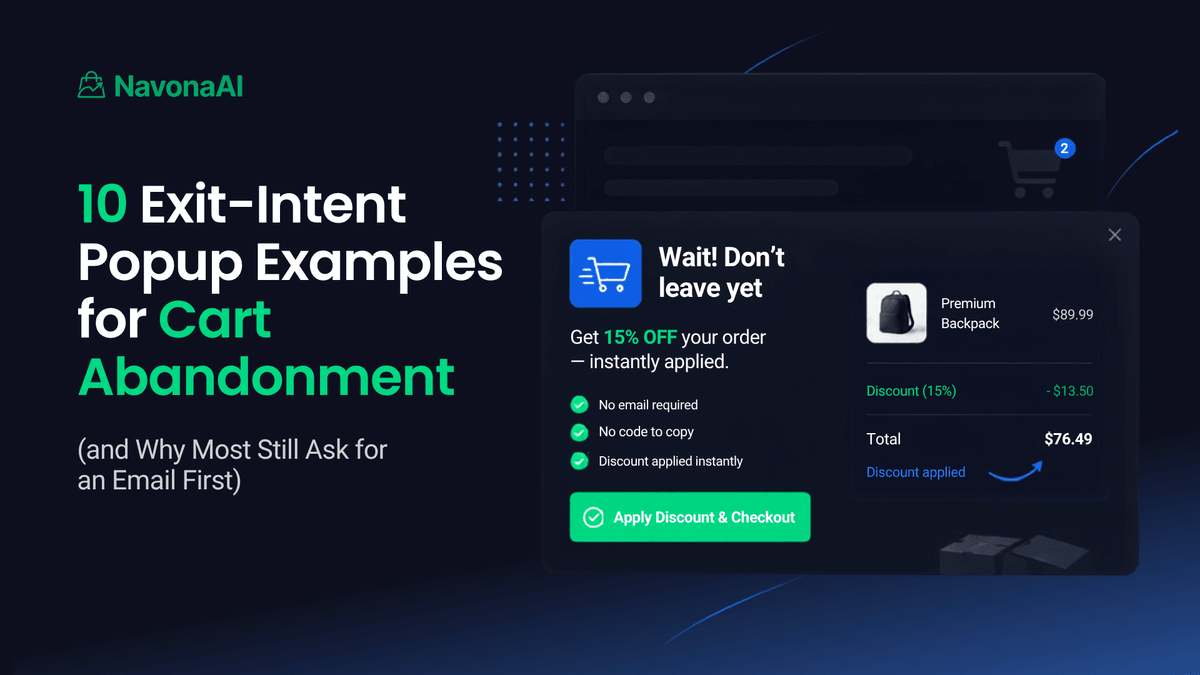
Look at almost any list of exit-intent popup examples and you'll see the same pattern over and over. A visitor is about to leave, a popup appears, and it asks for an email address before it gives anything back. That's true whether the store sells beauty products, coffee, or software. This works, that's not in question. But it also means almost every example is solving the same problem: get the email before the visitor leaves. That's not the same as the problem happening: a shopper already has items in their cart and is one click from buying. They don't need to be turned into a lead first. They just need to complete the purchase.
Below are ten popup patterns worth knowing. The last one is a different kind of popup entirely, an AI prevention popup, not a traditional exit-intent popup and not a capture or recovery tool. More on that difference below.
1. The straightforward discount code
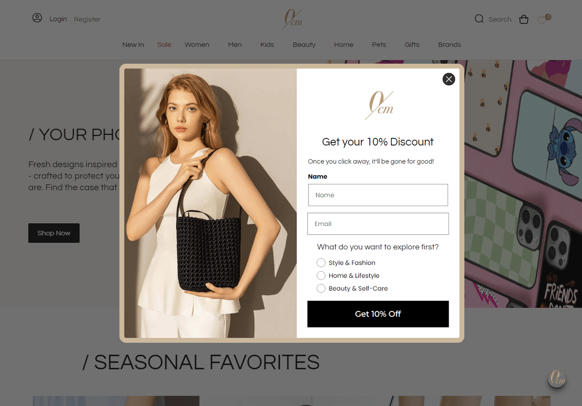
The pattern: A percentage off, shown clearly, with a field to enter an email to get the code.
This is the most common exit-intent popup on the internet. It's simple, and shoppers understand it right away. The catch is the email step. The visitor has to type their address, check their inbox, and copy the code back into checkout. Each step is a chance for them to give up and leave anyway.
Where it falls short for cart abandonment: if the shopper already has something in their cart, all of this is extra friction on a sale that was already halfway done.
2. The countdown timer discount
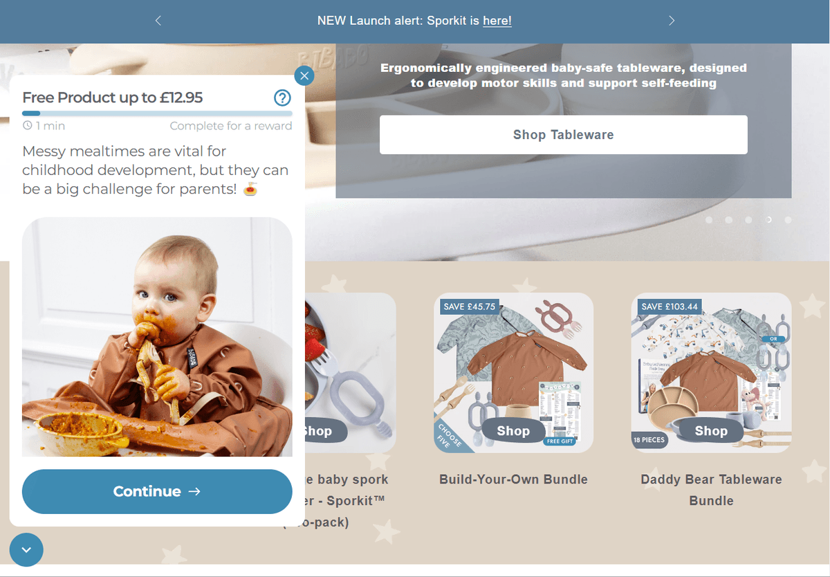
Some tie the countdown to a free reward instead of a straight discount:
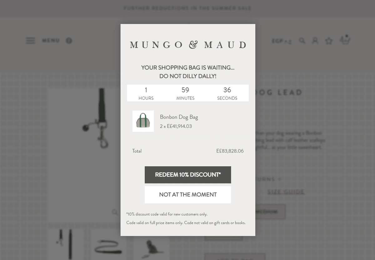
The pattern: Same discount, but with a timer counting down, often 10 or 15 minutes.
A real deadline can turn "I'll decide later" (which usually means never) into "decide now." This works when the deadline is real.
Where it falls short: a lot of these timers reset every time the same visitor reopens the tab or comes back later. When shoppers notice that, the timer stops meaning anything.
3. The free shipping unlock
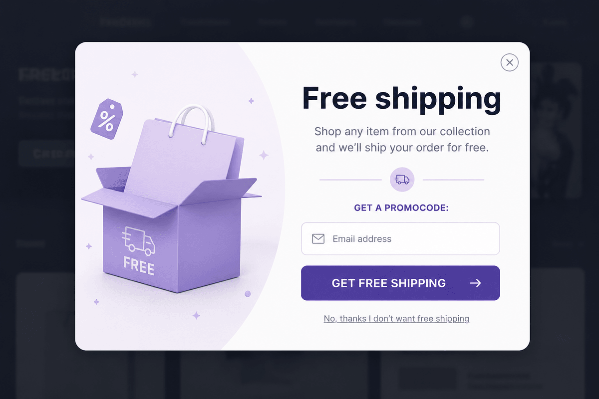
The pattern: Instead of a percentage off, the popup offers free shipping, most of the time only above a minimum order.
Unexpected shipping costs are one of the most common reasons people abandon a cart. A percentage discount doesn't touch that problem. Free shipping does.
Where it falls short: it only helps if shipping was actually the reason someone was leaving. If they were hesitating for another reason, this offer misses.
4. The spend-more threshold popup
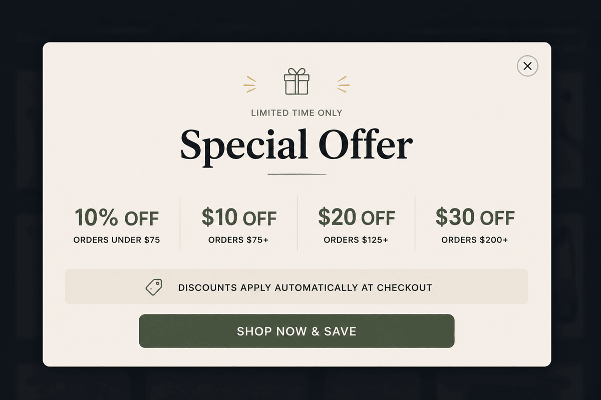
The pattern: Instead of a flat offer, the popup shows how close the shopper is to something better, "add $12 more for 20% off" or "you're $15 away from free shipping," based on what's already in their cart.
This isn't giving something away, it's asking the shopper to add more. That protects your margin while still giving them a reason to stay.
Where it falls short: it only works on someone close to the threshold already. Show it to someone far below the line, and it just points out how much more they'd need to spend, which can push them to leave instead.
5. The gamified popup

The pattern: A gamified popup where the visitor spins a wheel or scratches a cart for a random discount, usually still behind an email field.
People like the game. "I might as well spin, I have nothing to lose" is a real feeling, and it tends to beat a plain form for list-building.
Where it falls short for cart pages: it's still a lead-gen tool dressed up as a discount. A shopper who already has items in their cart doesn't need to be entertained into giving up their email. They need the friction gone.
6. The product recommendation popup
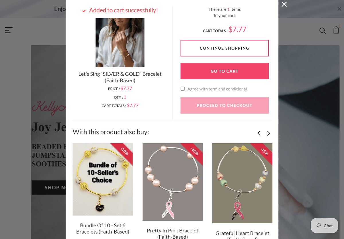
The pattern: Instead of a discount, the popup shows a suggested product based on what the visitor has been browsing.
Common on higher-end stores, where a blunt discount can feel cheap. It works well for browsers who haven't decided on anything yet.
Where it falls short: it's not made for someone with items sitting in a cart. Once there's a cart, the question isn't "what else might you like." It's "what's stopping you from finishing this."
7. The exit survey
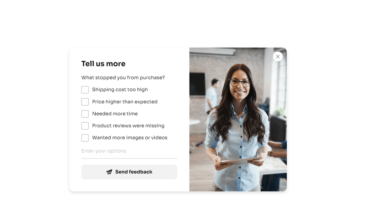
The pattern: One question, "What stopped you from completing your order today?", with a few clickable answers instead of a text box.
This is the only popup on this list that isn't trying to convert the visitor at all. It's collecting information. It works because answering takes two seconds, and it can surface real problems (confusing sizing, unclear returns, price) that don't show up anywhere else.
Where it falls short: it doesn't recover the sale in front of you. It's a research tool, not a sales tool.
8. The cart reminder with urgency
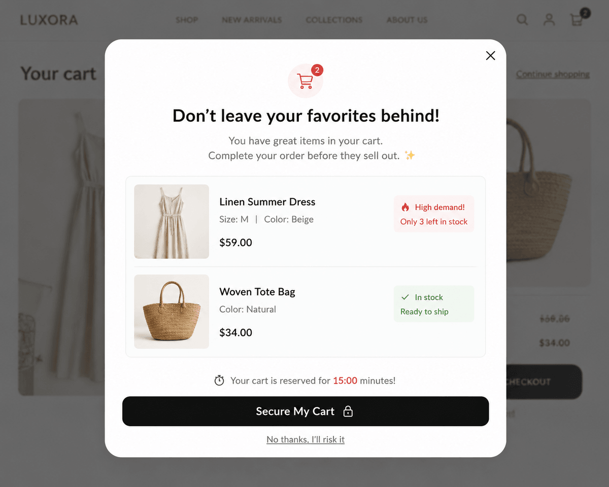
The pattern: A popup showing the actual items in the visitor's cart, sometimes with a note like "these are in high demand" or "only 3 left."
This gets closer to the real problem than most examples above, since it shows the shopper exactly what they're about to lose.
Where it falls short: it shows the shopper what they're missing, but it doesn't actually remove whatever made them want to leave. They still have to go back through the same slow checkout as before.
9. The demand signal popup
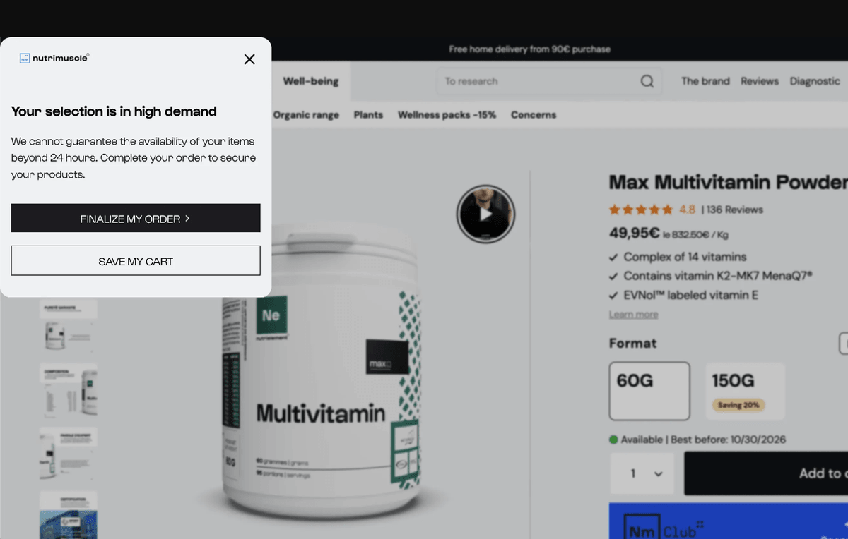
The pattern: No discount at all. Just a signal that plenty of other shoppers want the same thing, phrased as "in high demand" or "we can't guarantee availability," instead of a star rating, a review, or a customer count.
This costs nothing, which makes it worth trying before jumping straight to a discount. It leans on perceived popularity rather than price, so it works best when the real hesitation is "is this actually worth it," not the cost.
Where it falls short: if the shopper's real hesitation is price or shipping, a demand signal doesn't answer that.
10. The AI prevention popup: instant discount, no email
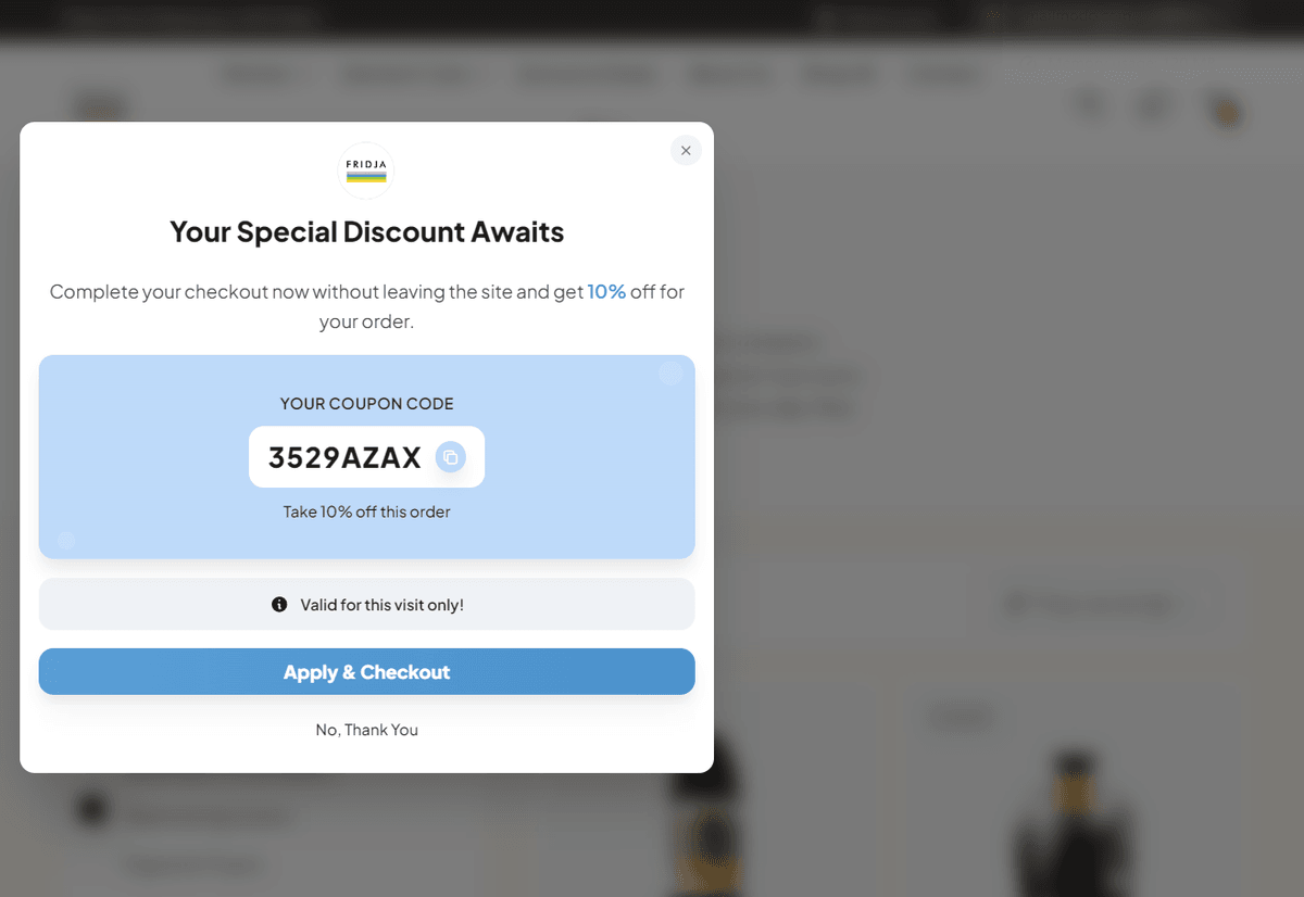
The pattern: A shopper with items already in their cart moves to leave. The popup applies a discount straight to their cart, no email field, no hunting through an inbox for a code. One click on Apply & Checkout, and the discount is already there.
This one is worth separating from everything above it, because it isn't really an exit-intent popup, and it isn't a recovery tool either. (For a deeper look at that distinction, see AI Cart Abandonment Prevention Popups vs. Exit-Intent Popups.)
An exit-intent popup reacts to one signal: the visitor looks like they're leaving. It asks for the visitor's email or phone number, shows the same offer to everyone, and hopes it works. A recovery tool, like an abandoned-cart email, waits until after the shopper has already left and tries to bring them back later, if they ever open the email at all.
An AI prevention popup works differently. It watches shoppers with items in their cart and predicts two things at once: is this person actually about to leave, and would an offer even change their mind. It only steps in when both are true, which means it isn't just reacting to a cursor movement, it's deciding whether stepping in is worth it at all.
The urgency is real too. The discount is made for that one shopper, for that one visit. If they leave without using it, the code stops working. Not a timer that resets on their next visit. The offer is actually gone.
This is the approach NavonaAI uses. It's built for cart pages specifically, so it doesn't show up for a browser with an empty cart, and it never asks for an email at all.
If you're driving traffic to your store, watching people add to cart, and then losing them right before checkout, this is the gap the other nine examples don't close. They're all built to grow a list or start a conversation. The NavonaAI prevention popup is built to stop the sale from slipping away while it's still happening.
What actually separates a good exit-intent popup from a bad one
Looking at all ten patterns together, a few things keep showing up in the ones that work:
The offer matches the reason someone is leaving. A discount doesn't fix a shipping problem. Free shipping doesn't fix someone who was just browsing. A review doesn't fix a price objection. Match the offer to the real reason, or you're just interrupting people for nothing.
Fewer steps convert better. Every extra field or question is another chance for someone who was already leaving to actually leave. This matters most at checkout, where the shopper is closest to finishing and has the least patience left.
Urgency only works if it's true. A timer that resets, or an offer that quietly shows up again next week, teaches shoppers to stop believing the message.
Cart pages need a different popup. Someone reading a blog post, someone browsing with an empty cart, and someone with three items in their cart are not in the same mindset. Showing them the same popup treats different situations as one.
Losing sales at the cart, not just the homepage?
Most exit-intent popups are built for one job: growing a list. That's useful, but it's a different problem than the one happening on your cart page, where a shopper has already decided what they want and just needs the last bit of friction removed.
If that's the sale you keep losing, NavonaAI is built for exactly that moment. No email step, just an instant discount applied the second a shopper with items in their cart is about to leave.